A one page website is a site where all the content sits on a single page you move through by scrolling, with a menu that jumps straight to the right section. It’s a simple, direct format, perfect when your offer fits one clear message, for example a freelancer, a restaurant, an event or a product launch. It usually costs less than a classic multi-page site, but it shows its limits fast once you have a lot of content or you want to be found on Google for many different topics. Here’s how to tell whether this format is the right choice for your project, and how to get it right.
What is a one page website?
A one page website gathers onto one single page everything a site usually spreads across several: who you are, your services, some proof you can be trusted and a way to reach you. Instead of clicking from page to page, the visitor moves down the page by scrolling, and each section follows the next like the chapters of one story.
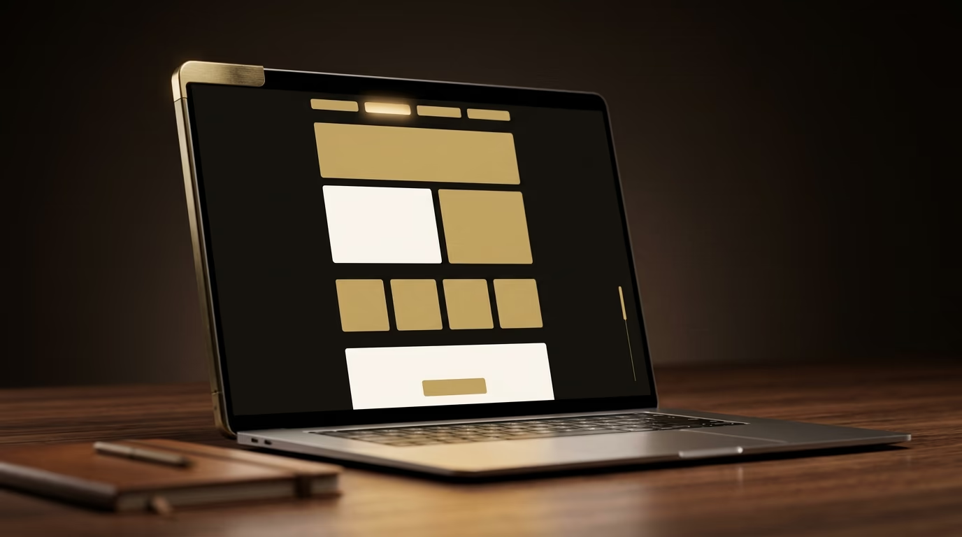
The menu at the top of the screen doesn’t lead to other pages: when you click a link, it glides back to the right section of the page without ever reloading anything. This format took off with the phone, because scrolling a screen with your thumb has become the most natural gesture in the world, far more than hunting for a link to tap. A one page website takes that exact habit and puts it to work for your business, guiding the visitor from one end of your message to the other without ever asking for a complicated decision. That flow is its strength, and sometimes its weakness too, once the content starts to overflow.
One page website, landing page or showcase site: what’s the difference?
The difference comes down to what each format is for: a one page website presents your whole business on a single page, a landing page pushes the visitor toward one precise action, and a showcase site spreads your business across several separate pages. These three formats look alike from a distance, and plenty of sites confuse them, but they don’t do the same job at all.

A landing page is a single page built around one goal, for example capturing a sign-up or selling one specific product. People usually arrive there from an ad, and you deliberately strip out the menu to leave the visitor only one possible path. A one page website, on the other hand, keeps a menu and tells your whole story: who you are, what you offer, why you can be trusted and how to get in touch. It informs and reassures as much as it prompts action.
A showcase site, finally, says the same things as a one page website, but split across several separate pages: a home page, an about page, one page per service and a contact page. It’s the format to pick when you have too much content for a single page, or when you want each service to have its own address on the web. Keep this simple rule in mind: a one page website is a showcase site squeezed onto one page, while a landing page is a sales tool that only ever wants one thing.
What are the advantages of a one page website?
The main advantage of a one page website is how simple it is, for you and for your visitors, because everything sits in one place and reads in one go. The visitor has no decision to make: they move down the page, discover your message in the order you chose, and land naturally on the contact button placed at the end.

That continuity gives you real storytelling power, because you control the exact order in which your arguments arrive, a bit like a salesperson who delivers their pitch without being cut off. A caterer, for instance, can walk the visitor from a mouth-watering photo to the menu, then to a few glowing reviews, and only then to the booking button, so every doubt is answered before the ask. A single-page site is also faster to build and cheaper than a multi-page one, since there are fewer pages to design, write and link together. It behaves very well on a phone, where scrolling is already the gesture everyone uses all day long. And because there’s only one address to remember and share, it’s easy to hand out on a business card, in an email signature or on a social profile. For a clear offer that fits into a few sections, this format delivers a clean result, quick to launch and pleasant to move through.
What are the limits of a one page website?
The limit of a one page website shows up as soon as your content grows, because with everything on the same page, it quickly becomes long, heavy to load and hard to change. What was an advantage when the offer was simple turns against you once you have a lot to say.

The first issue is the weight of the page: since all the content loads in one block, a one page website packed with images and videos can become slow, and a slow site drives visitors away as much as it displeases Google. This question of speed matters so much that it deserves constant attention, as the Core Web Vitals that measure the loading experience explain. The second issue is growth: when you want to add a new service or a new section, you have to reorganise the whole page instead of simply adding one more page. The third issue is tracking your results, because it’s harder to know which part of the page really interests your visitors when everything lives at one address. And the last one, the heaviest for your visibility, is search ranking, which we’re about to look at closely.
Is a one page website good for SEO?
A one page website can rank very well on one precise topic, but it hits a ceiling as soon as you want to be found for many different words. The reason is easy to understand once you know how Google sorts sites.

Google ranks pages, not whole sites, and each page can only seriously target one main theme, with one title, one description and one main visible heading. A one page website owns just one page, so it gets one shot at ranking for a topic. For a freelancer offering a single service in a single town, that’s perfect, because they only need to stand out on a handful of very targeted searches. Take a plumber based in one town, with a well-built one page website: they can easily rank on a search like plumber followed by the name of their town, because the whole page is about that trade in that place. The same plumber who wanted to show up for repairs, bathroom renovation, heating and five neighbouring towns will never manage it with a single page, whereas a site where each service and each town has its own page covers all that ground. So the trouble starts when you offer five different services, or you want to be found in several towns, or you plan to publish articles to attract people. In those cases, a multi-page site wins by a wide margin, because each page chases its own topic and the whole set covers far more searches. If your visibility on Google really matters, take the time to understand how to rank your website on Google, and know that a blog or coverage of several towns almost always means stepping out of the single-page format. To reach customers close to you, local SEO is still possible on a one page website, but it too shows its limits once you cover several places.
Who is a one page website really right for?
A one page website is right for businesses whose offer is simple and fits one message: a freelancer, a tradesperson, a restaurant, a therapist, an event, a portfolio or a product launch. What all these cases share is that there’s one important thing to say and one action to get from the visitor.
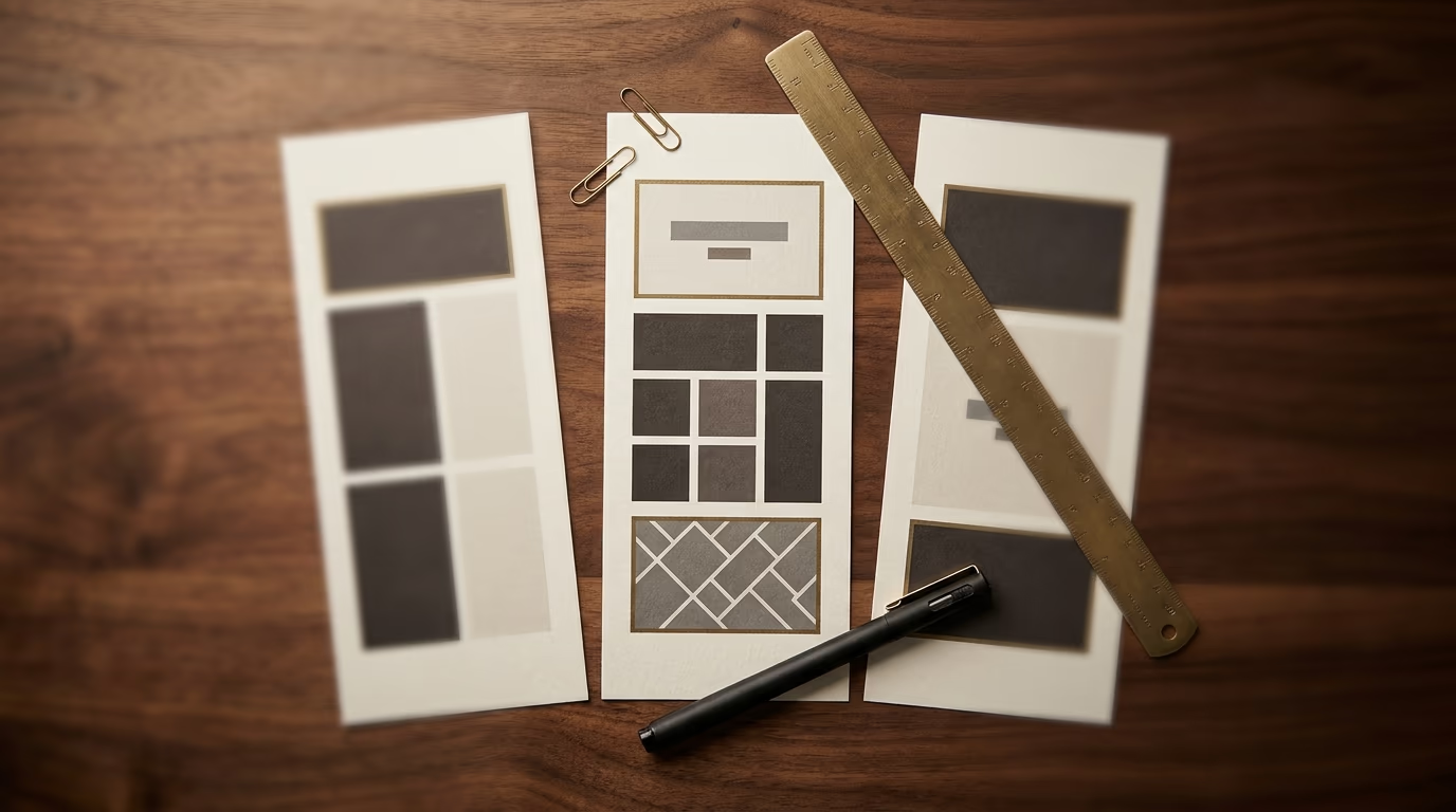
Choose a one page website if your offer comes down to one main service, if you want a site online quickly, if your budget is tight and if you haven’t planned to publish content regularly. A restaurant that wants to show its menu, its atmosphere and its opening hours, a photographer presenting their work and their rates, a coach explaining their method and offering a first appointment: each of them finds this format clear and sufficient. On the other hand, go for a multi-page site if you offer several distinct services, if you want to be found on many searches, if you’re planning a blog or a shop, or if you know your business will grow within the year. A showcase site with several pages then gives room to each idea and prepares the future better. The right reflex is to start from your message before choosing the format: if everything you have to say fits comfortably on one page you can read in a minute, a one page website is an excellent choice, otherwise it will box you in too soon.
How much does a one page website cost?
A one page website usually costs less than a classic site with several pages, with a modest yearly cost if you build it yourself on an off the shelf tool, and a larger budget for a professional custom one page website. The gap between the two is wide because the price mainly depends on the care put into the design, the copy and the speed.

The version you build yourself on an online tool comes to a small monthly subscription, which stays very affordable, but you pay in time what you save in money, between learning the tool, writing the copy and fine tuning the details. The version handed to a professional costs more because it includes real design work, copy that sells, well-prepared images and a page that’s fast on a phone. This budget stays below that of a full showcase site, precisely because there are fewer pages to design. On top of the build price come recurring yearly costs, covering the domain name, hosting and maintenance, the same as for any site. If you want to place these costs in the wider picture of prices, my article on how much a website costs breaks down each item.
How do you get the structure of a one page website right?
Getting a one page website right comes down to the order of its sections, because each one has to answer the question the visitor is asking at that point in their reading and lead them naturally toward the contact. On a single page, the sequence matters as much as the content itself.
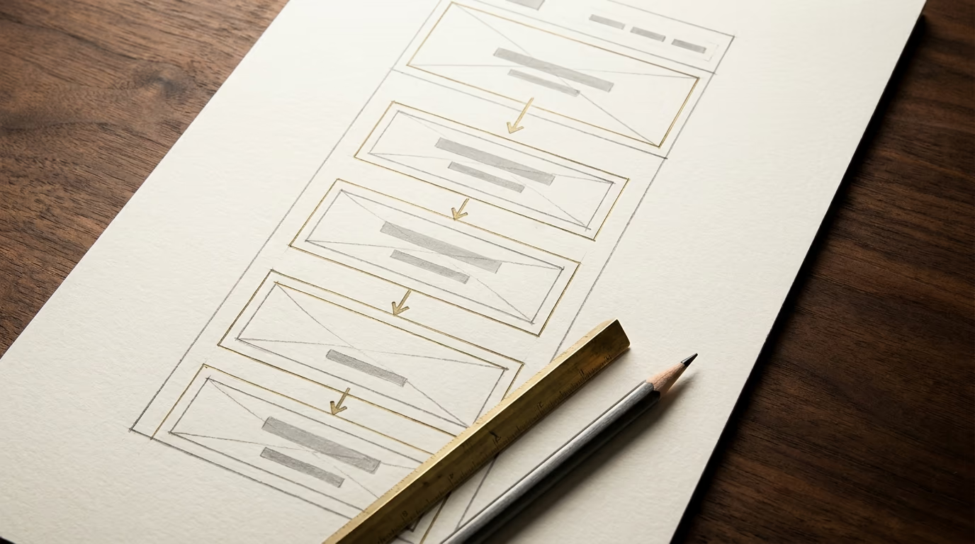
Start with a first section that says in one sentence who you are and what you bring, because the visitor decides within seconds whether to stay or leave. Follow with the problem you solve, then your concrete offer, then proof you can be trusted such as photos of your work, client reviews or references. End each big step with a clear invitation to get in touch, repeated in several spots on the page, so the visitor can act the moment they’re convinced without scrolling all the way back up. Polish the menu so it glides smoothly toward each section, and keep the page light by compressing images and loading the heavy elements only when they appear on screen, otherwise the length of the page ends up slowing it down. Finally, check that everything stays perfect on a phone, where most of your visitors will discover you, a point covered in my article on responsive design. Taking the time to map that order in advance, like a website mockup, saves you from reorganising everything once the site is live.
Where to start with your one page website
A one page website is a genuine professional choice for a simple, focused offer, and it gives a clear result that’s quick to launch when it’s done well. It only becomes a bad choice when you ask it to carry content that’s too rich or a visibility ambition a single page can’t hold.
So the best place to start is to write down, in plain words, the one message your site has to get across, then look honestly at whether it fits on a page you can read without tiring. If it fits, go ahead with a one page website and put your care into the order of the sections and the speed. If it already overflows, you’re better off starting with a multi-page site rather than rebuilding everything in six months. Keep in mind that the right format is always the one that matches your message, not the other way around.