A call to action, or CTA, is the element on a web page that invites your visitor to act: the button they click to request a quote, the link that takes them to your form, the image that nudges them to subscribe. It’s the tipping point between someone who reads and someone who becomes a customer. A good call to action stands out at a glance, promises a clear benefit, and is as easy to tap with a thumb on a phone as it is to click with a mouse on a desktop. Here’s how to design, write, and place one so it actually works for you.
What is a call to action, exactly?
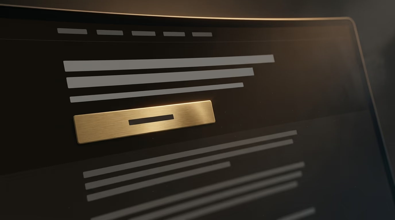
A call to action is the visible invitation that tells your visitor what you want them to do at that precise moment of their visit. On a professional site, it’s almost always a well-contrasted button with text like Request a quote, Book a call, or Add to cart. Without it, a page can be beautiful and well written, yet it leaves the visitor stranded at the roadside without ever reaching out a hand to invite the next step.
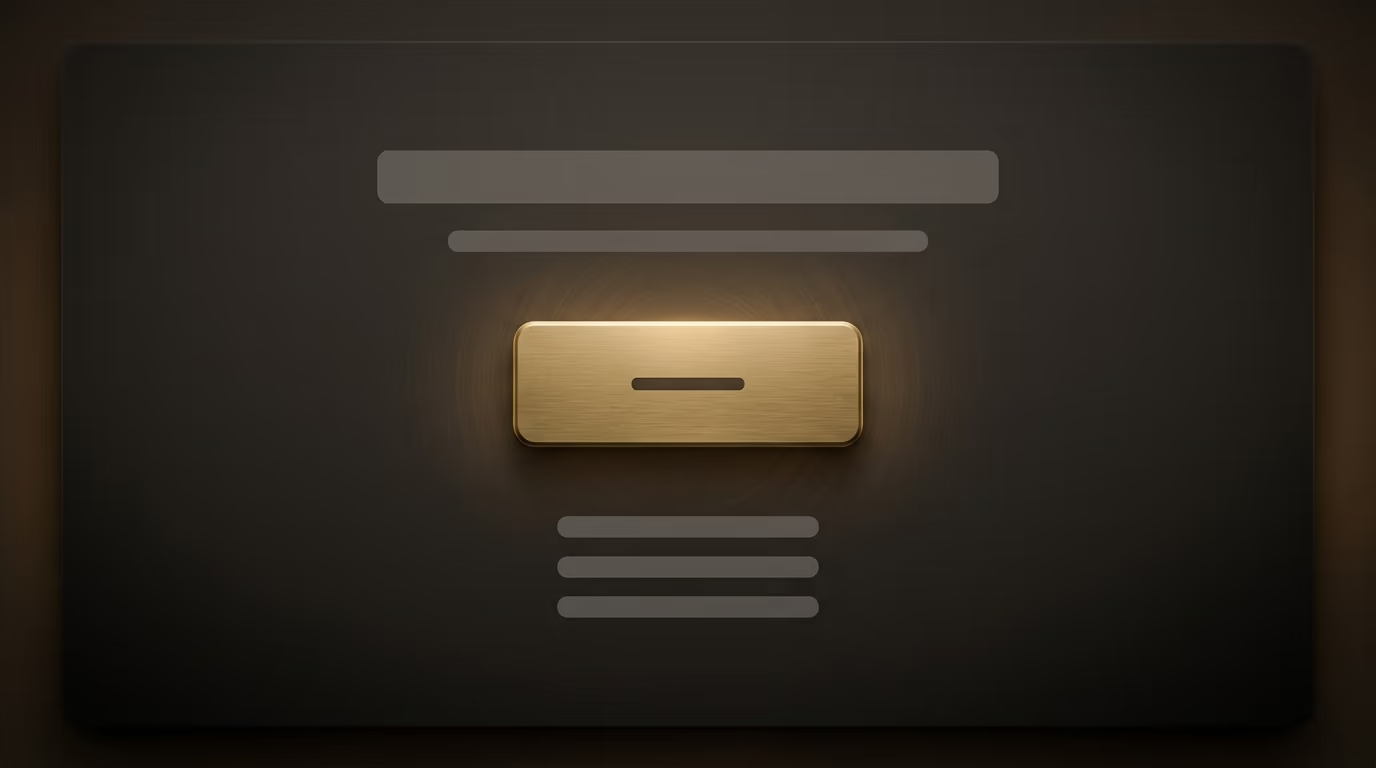
The name comes from marketing, where the phrase literally means a call to act. In everyday practice people say call to action, CTA, or action button interchangeably, and you’ll run into these terms the moment anyone talks about conversion. Conversion is simply the point where a visitor does what you hoped they would do, and the call to action is the tool that makes that moment possible.
It doesn’t always take the shape of a button. An underlined text link in the middle of an article, a banner across the top of a page, a window that appears at the right moment, a clickable image at the bottom of a product page, all of these can play the role of a call to action. The button stays the most recognizable form because its very shape announces that it can be clicked, but what matters isn’t the shape, it’s the clarity of the promise and the ease of the gesture. A landing page built around a single goal rests entirely on the strength of its call to action, and it’s often the first element a professional reworks when a page fails to convert.
Which type of call to action fits which goal?
The right type of call to action depends first on where your visitor sits in their thinking, because you don’t ask the same thing of someone discovering your site as you do of someone already comparing your offers. A visitor arriving for the first time isn’t ready to buy, and pushing a Pay now button under their nose scares them off as surely as a pushy salesperson would.
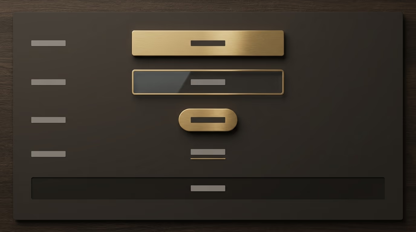
Early in the journey, when a person is barely getting to know your world, the call to action should ask for little commitment: read an article, download a guide, subscribe to a newsletter. These buttons are sometimes called micro-conversions, because they move the relationship forward without demanding a heavy decision. In the middle of the journey, when the visitor compares and hesitates, you can offer something more involved like a webinar, a demo, or a price estimate. At the end, when the person is warm, the ask becomes direct: Request a quote, Book a call, Add to cart, Pay.
This logic gives a simple rule for choosing the call to action on each page. On your homepage, the goal is to guide people toward the right section rather than sell in one shot, so a button like See my work or Explore my services does the job better than a Buy now. On a specific service page, where the visitor is already looking for a solution, a Request a quote or Contact me lands right. And at the end of a blog post, a link that extends the reading or offers a free chat respects the reader’s mindset, since they came to learn and not to sign a contract. Matching the weight of the ask to the moment of the visit changes everything, and that’s exactly what a good conversion funnel organizes step by step.
How do you write a call to action button people want to click?
The text on a call to action should tell the visitor what they get by clicking, not what the click costs them. A button reading Submit, Send, or Confirm describes an effort you’re asking of the visitor, while a button reading Get my free quote describes a benefit they receive. That simple flip of viewpoint, toward the person reading rather than toward your form, often lifts the click rate without changing anything else on the page.

First-person wording works especially well, because it puts the visitor in the role of the one deciding. A button reading Book my call feels like a thought the person forms in their own head, while an imperative like Book your call keeps a salesperson’s distance. Both forms work, but try first person when you want the sense of a personal choice rather than an order. The most polished brands also play on reassurance right under the button, with a small line like No commitment or Reply within 24 hours that lifts the last hesitation at the decisive moment.
Three principles hold up most good button texts. Start with an action verb that describes the concrete gesture, like book, get, download, or discover, rather than a hollow word. Keep it short, because a button is read in a fraction of a second and a full sentence dilutes the message. And name the real benefit whenever space allows, swapping Learn more for See pricing or Read customer reviews, which say exactly where the click leads. A visitor who knows precisely what waits on the other side clicks more willingly than one you leave in the dark.
Where should you place your calls to action?
Where you place a call to action often matters more than the button text itself. A First Page Sage report published in April 2025, which analyzed conversion rates across seventy-one client sites, found that the same signup button converted about 9.8 percent of visitors inside a well-designed popup, but only 0.9 percent at the bottom of the page. Same action, same text, roughly ten times the result from placement alone.
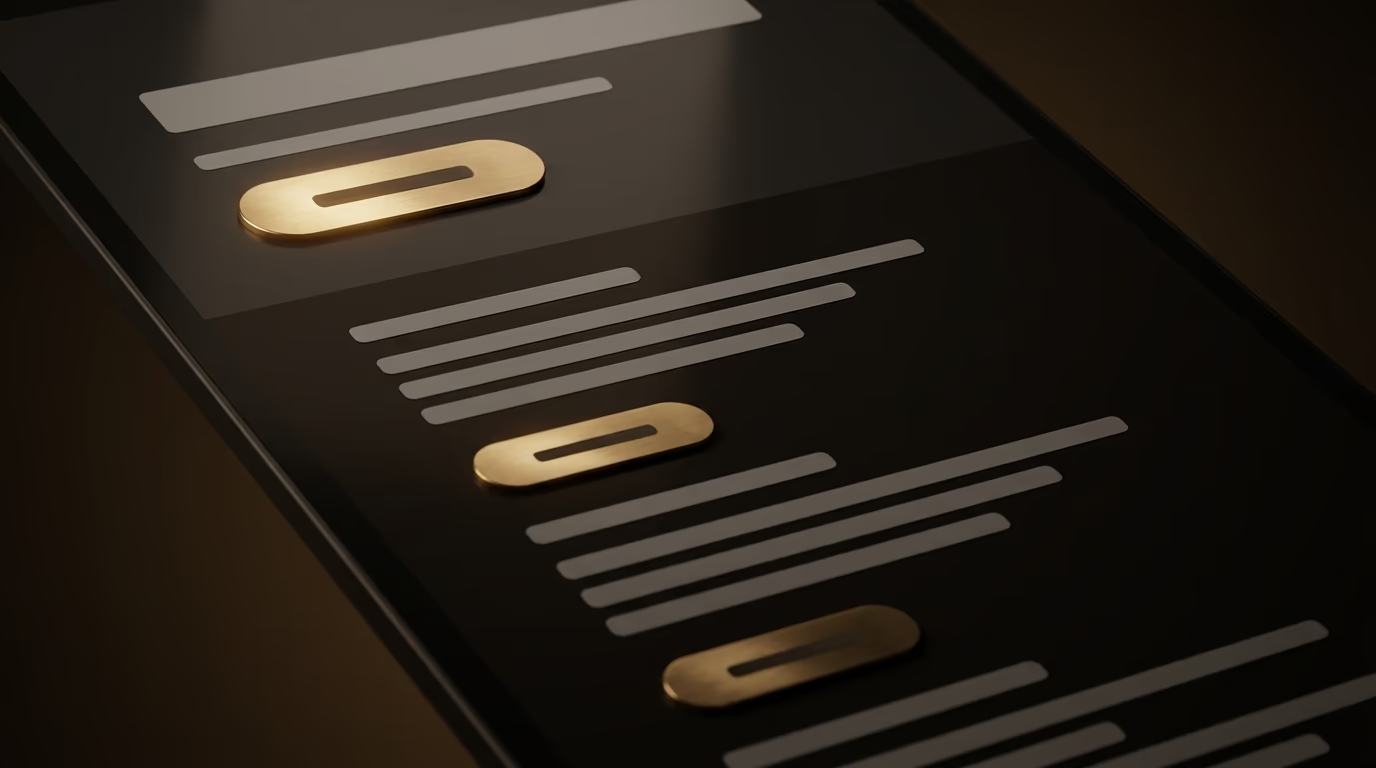
The baseline rule is to offer a first call to action that’s visible without scrolling, in what designers call the area above the fold. That’s the zone everyone sees, including hurried visitors who will never scroll further down. But that rule doesn’t mean one button at the very top and nothing after. On a long page, the ideal is to repeat the same invitation at regular intervals, so the person convinced halfway through their reading doesn’t have to scroll all the way back up to act.
The same First Page Sage report shows that bottom-of-page spots and links buried in a sidebar rank among the weakest performers, with rates that sometimes fall below 0.4 percent, while well-thought-out popups top the ranking. That doesn’t mean you should smother visitors in aggressive windows, which annoy as much as they convert, but that placement deserves as much care as the message. Put your main call to action where the visitor’s attention is already caught, right after an argument that convinced them, and not exiled to a footer no one looks at.
What color and design make an effective button?
A good call to action button stands out clearly from everything else on the page, because its only job is to draw the eye toward the action. The question isn’t which magic color converts in the abstract, a myth that refuses to die, but which color contrasts with the rest of your visual world. A button in a shade that appears nowhere else on the page becomes a natural anchor for the eye, while a button the same color as your headings blends into the crowd.
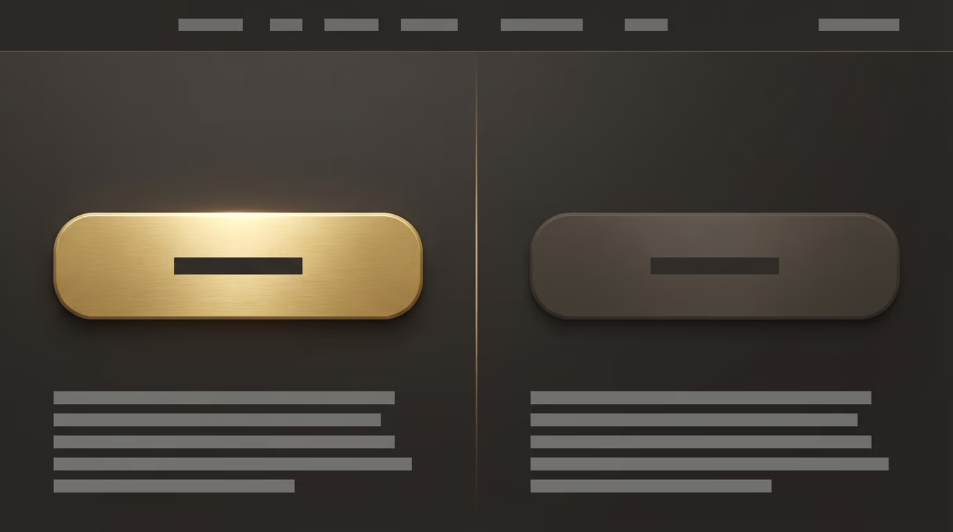
Contrast isn’t only a matter of taste, it’s also a measurable readability requirement. The international accessibility rules, the WCAG, set a minimum contrast ratio of 4.5 to 1 between text and its background for normal-sized text, and 3 to 1 for larger text. A button whose text meets that threshold stays readable for someone with poor eyesight, under sunlight glaring off the screen, or on an old device with washed-out colors. You can check any color combination in seconds with an online contrast tool, and that reflex spares you plenty of buttons that look great in a mockup but turn out unreadable in real life.
Beyond color, a few shape details help the visitor understand that something is clickable. A firm button shape, with a solid fill rather than a plain outline, reads better than a discreet link. A little empty space around the button isolates it from the rest and reinforces its importance. And a visible change on mouse hover, like a slight darkening, confirms to the visitor that the element really is interactive. These principles sit inside a broader approach to web accessibility, which aims to make your site usable by as many people as possible without giving up any of its polish.
How do you make calls to action work on mobile?
On mobile, a working call to action has to be tappable with the thumb alone and no effort, because most of your visitors meet your site on a phone held in one hand. A button designed for the mouse, small and precise, becomes a source of frustration the moment a finger tries to reach it. The missed target, the click just off to the side, the accidental zoom, all of it pushes a hurried visitor to give up before they even act.
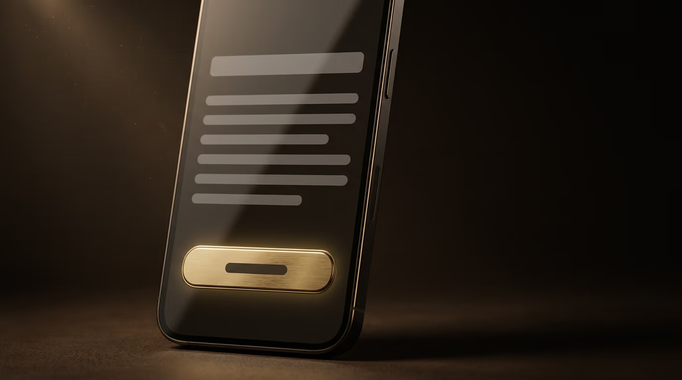
The size of the tappable area is the first thing to watch. The WCAG accessibility rules recommend a target of at least 24 pixels on each side at the standard conformance level, and go up to 44 pixels on each side for the strictest level, a value most mobile interface designers keep as a comfortable benchmark. In practice, a thin button or a tiny text link won’t do on mobile: you need a firm surface, with enough margin around it to avoid unlucky neighboring taps.
Placement matters just as much as size. The thumb of a hand holding a phone reaches the bottom and center of the screen easily, but struggles to climb to the top corners. An important call to action therefore benefits from sitting in that natural thumb zone, often near the bottom of the screen, sometimes as a button that stays visible while the page scrolls. Finally, check that your button keeps the same contrast on mobile as on desktop, since a phone screen used outdoors in full daylight is far less forgiving than a monitor in an office. A site built mobile first treats the mobile call to action as the primary version and not as a second-rate adaptation.
How many calls to action per page, and how do you test them?
One primary action per screen almost always beats a stack of buttons fighting for attention. When you present a visitor with two choices of equal weight leading to different goals, you force a decision on them, and one more decision is one more chance to hesitate and then do nothing. This hesitation in the face of too much choice carries a real cost on your conversions, which is why the most effective pages keep one clear dominant goal.
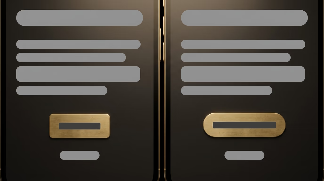
That doesn’t mean a single button on the whole page. You can, and often should, repeat the same call to action in several places on a long page, since it points to the same action. What you want to avoid is the duel between two rival buttons placed side by side, like Buy now next to Download the brochure, where each weakens the other. When a secondary action genuinely has its place, give it less visual weight, for example a plain text link beside the main button, so it stays available without stealing the show.
The only way to know what truly works on your audience is to measure, then test. Track the click rate of each button, meaning the share of visitors who click, and the final conversion rate, the share who go all the way through the action. When a number looks weak, run a comparison test, often called an A/B test, where half your visitors see one version of the button and the other half see a variant, on a single change at a time: the text, the color, or the placement. Changing one parameter per test tells you precisely what made the difference, while a full redesign leaves you guessing. A call to action is refined over time, through small measured improvements, like the rest of a conversion funnel you fine-tune month after month.
Turning your calls to action into a real sales lever
A call to action deserves as much care as the rest of your page, because it’s the exact moment your site stops informing and starts working for you. Go back through each of your important pages with one simple question in mind: what do you want the visitor to do here, and does the invitation to do it stand out clearly enough for them to notice it and click it without effort, including on a phone held in one hand. A benefit-focused text, a button that stands out from the background, a spot inside the natural field of vision, a comfortable target for the thumb, these are the points that separate a page people like from a page that earns.
The good news is that these adjustments cost little and get fixed fast, unlike a full site redesign. If you want an outside eye to comb through your pages and spot the calls to action that leave customers by the wayside, let’s talk about your project and find where your easiest wins are hiding.